Thank you for taking part in the NotSlot journey!
We invite you to join us in our next chapter:
2.5D Games in Unity Part 1: Basic Scene
2.5D games come in many flavors. A popular approach is to use a 3D environment and assets but limit the player movement to only two axes. Another method would be to use 2D assets while exploiting the third dimension only for its parallax effect.
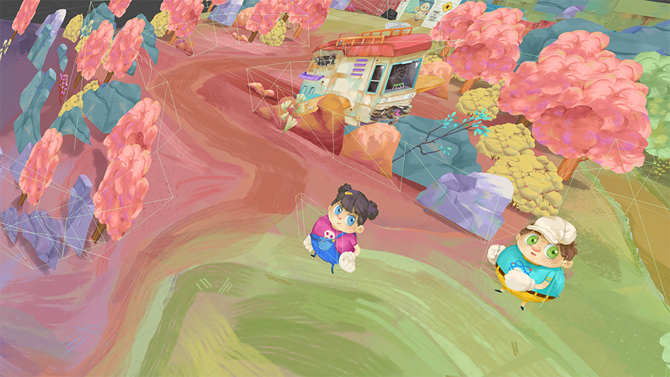
For our game Nugget & Penny, we chose a different approach, we use 2D assets to describe the world while retaining all three axes of movement. We saw this style in a few games and immediately fell in love!

During the development of Nugget & Penny, we encountered a few challenges while implementing the game’s art style. The following are tips we have learned while working with this style and a few solutions to its pitfalls.
The Recipe
There are three ingredients required to achieve the desired style:
- Cards – the most important component, these are your 2D art & animations. Layed out with an
X-axis rotation of45°. - Ground – while you may use a flat plane, we like creating a 3D mesh. No need for complex shapes – the majority of the ground details will come from the texture painting.
- Camera – use a static
X-axis rotation of45°. This way, the Cards will appear perpendicular to the player.
The Sweet Spot
I mentioned above that we use a 45° rotation for the Cards and the Camera. You can choose a different angle, take a look at the effect different angles have over the same scene:
So, why have we chosen 45° over the other degrees?
The resulting scene with 60° appeared flat, so it was an easy rejection. In contrast, the 30° scene felt spot-on, although there are a couple of drawbacks compared to the 45° scene:
- The field of view was too large, requiring bigger worlds and details, even for locations the players will never arrive at.
- Mathematically,
45°is more approachable for a few computations that we will discuss later on.
Rotations
Do not rotate the camera beyond its initial rotation or other axes. You may translate it in any axis, and using Cinemahine yields fantastic results with this 2.5D style.
When it comes to Cards rotation, we do sometimes rotate the Y and Z axes, but never change to X-axis as it breaks the illusion.
Colliders
Developing our demo game, Adventure Machine, we attached angled colliders to the different game components. It resulted in sub-optimal results. Therefore, in the newer game, we are positioning the collider orthogonal to the ground.
Another difference from the demo is creating colliders for groups of objects instead of each object individually. This prevents players from getting stuck between objects. Creating a tool for quickly drawing custom collider shapes around objects made this approach fast and easy – I will write about it in the future.

The Missing ½D
Sometimes, describing the world with 2D Cards is just not enough. When we encounter such situations, mostly when players feel the skill mechanics are 'cheating', we don't hesitate to use 3D.
To blend the 3D meshes nicely with the 2D Cards, Danielle paints its texture with the same brushes and technique as the 2D art. The texture is then applied to an unlit material.
Another trick we use for a natural blend is to skew the mesh with a custom shader – we will expand on it in the second part of this article.
The Gravity Dilemma
For an object to go up or down, and feel natural, we need to keep the Z offset correlated to the Y offset amount. For example, If we raise an object 1 unit above the ground, we should also push it 1 unit away from the camera.
This is a rule we only conform to sparingly, and on a case-to-case basis. Our general guideline would be to break this rule when we use physics, so we aren't often required to change the object’s gravity behavior.
In the next parts we will look into three shaders I created to solve issues that popped up during development.
